Build and Price Redesign
Ownly

Overview
Ownly's goal is to disrupt the new home-buying experience by moving in-person sales interactions and transactions online. An important piece of the online home-buying ecosystem is the Build and Price experience which allows users to find the type of new home they are searching for and to perform customizations before saving their choices to a My Homes profile.
The first version of Build and Price had poor conversions of a key metric called Save. Users must sign up for an Ownly account before their Build and Price information can be saved to a My Homes profile. When we studied user experiences on Hotjar we observed them getting frustrated when navigating, with some users getting lost and dropping off early. We also observed hesitation when clicking some action buttons due to the use of confusing industry specific language. Ultiately, most users were dropping out of the experience before converting and saving their Build and Price.
When we interviewed Ownly's customers they expressed frustration with the quality and fidelity of the interface and requested features that had already been identified on the product roadmap.
We brought the entire team together and facilitated exercises to help them empathize with the user and customer pain points. Finally, we defined our goals for the next version of Build and Price:
Process
We didn't have a clear picture of all the features, flows and rules associated with the current Build and Price so we took a bit of time to map out the system and created an initial source of truth that the entire team could reference as a baseline.
We were intent on studying real-life experiences with Build and Price so we studied and observed many Hotjar sessions. It quickly became apparent that users were spending most of their time finding a new home type and then exploring customization options. We needed to concentrate on these two experiences to meet our design goals.
After meeting with a few of our builder customers we were able to prioritize two new features in the roadmap for the next version of Build and Price. With the help of engineering, we agreed that better filtering for new home types and an improved lot selection experience had low technical constraints and a high probability of being built in a tight time frame.
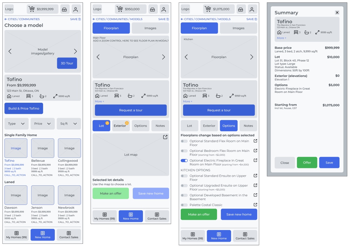
It was time to go wide with ideation and simple design exercises. We wanted to use early mock-ups to start validating ideas and get feedback from the team, our customers and the users.

After many iterations we were onto something good, the language was improving, and the new features were slotting in but the navigation and layouts of some steps weren't simple, we were still getting confused, and it was too busy.
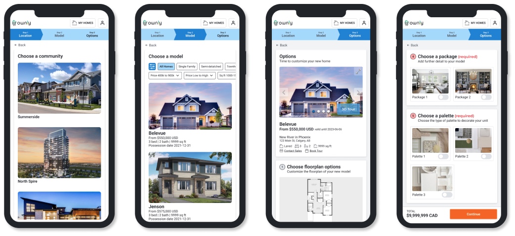
We needed to step back and do a bit more research on how the Build and Price steps were sequenced and laid out. We looked at other manufacturers of "big ticket" purchases and landed on how the car manufacturing sector approached Build and Price. We parsed through many car Build and Price experiences and found commonalities that could be applied to the Ownly solution.
After a couple of rounds of testing it quickly became apparent that the new navigation and layout approach was making sense, users were not getting lost and were moving forwards and backwards through the flow with ease.

Solution
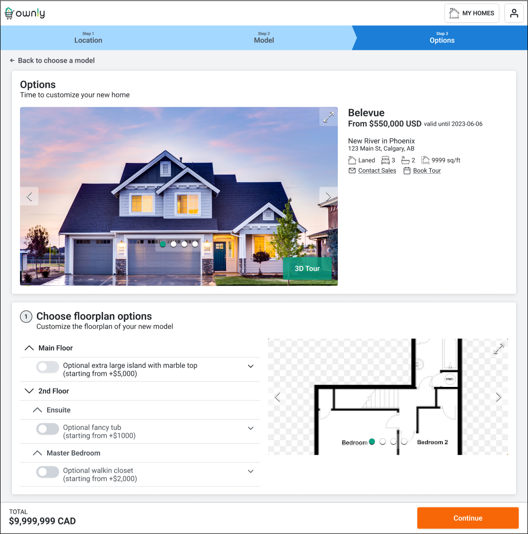
We continued to iterate on the new concepts and test them until we finalized the design. Handoff included acceptance criteria and additional rounds of meetings with engineering to ensure everyone was on the same page before committing to the development sprints.
We released the new flows to production and conducted an A/B test of conversion rates between the new and old designs. The results were concrete, conversion rates increased by 24%. The vast majority of the users were not getting confused or lost in the flow and were using the new features with ease. Engagement in the customization portion of the solution had increased by 32%.