Twitter Spam Violation Workbench
Innodata

Overview
Innodata is a global leader in ML/AI (machine learning / artificial intelligence) specializing in data collection for AI model training, annotating complex data to deliver accurate ground truth for ML/AI models and creating platforms that apply AI augmentation to client data.
The Twitter Spam Violation Workbench, one of many different types of annotation workbenches supplied to Twitter by Innodata, allows human moderators to quickly work through batches of Tweets that have been tagged for Spam Violation.
Moderators visually scan the offending Tweet, search through the user's account to find incidents of past violations and then answer questions to annotate the task. The annotated data is collated and sent back to Twitter to prime its ML algorithms ensuring the Twitter Spam Violation AI becomes more accurate over time. Moderators are scored by how many batches of tasks they can complete in a working session (SAR score). Moderators must work quickly, and consistently to produce quality annotations.
After receiving feedback from Twitter, the internal team identified a need to improve the volume, consistency and quality of the data being fed into their ML algorithms. After a few meetings with our Twitter team, product management, and engineering it was determined that the best course of action was to improve the workbench experience for moderators.
The team agreed on a couple of KPIs to measure success and then we hit the ground running.
Process
As the sole designer on the project I needed to get a clear picture of the workbench rules and how moderators flowed through the Spam Violation annotation process. First, I parsed through multiple documents to condense the workbench ruleset into a concise list of requirements.
The Twitter team supplied me with dozens of screen capture videos of moderators in action, this source of real-life interactions proved to be invaluable for the remainder of the project.
The videos exposed many pain points that inhibited the moderators from producing faster SAR scores. Moderators used many different browser tabs to view Tweets, user accounts, keyword searches, and to translate text into their native languages. Moderators were spending a significant amount of time copying and pasting text between browser tabs. We went back to the Twitter team and confirmed the validity of the pain points and determined that addressing them would help to increase SARs scores.
We had a large amount of data compiled detailing how moderators flowed through the workbench. After mapping the data, we met with the Twitter team to confirm our assumptions. It took a few iterations to get a correct baseline which we then used as a source of truth for going wide during the design phase.

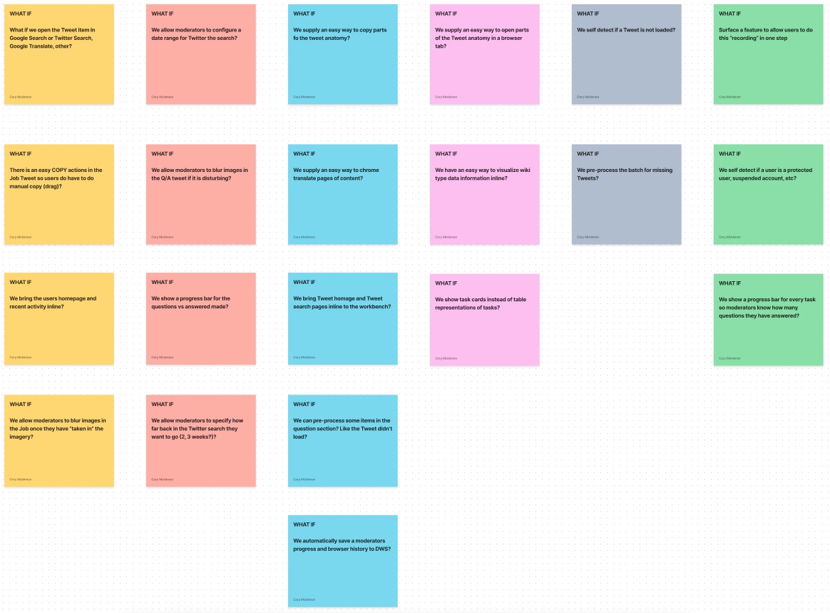
Including the Twitter team in every step of the design process was very important. We brought together key stakeholders and moderators for a “What If” exercise allowing us to go wide with our thinking.

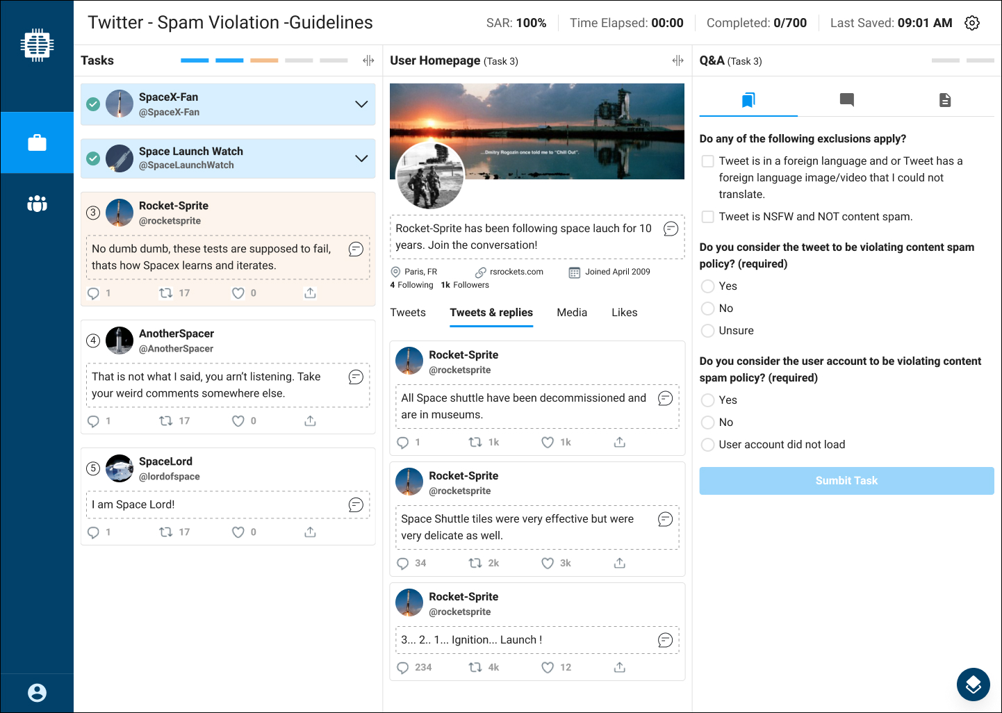
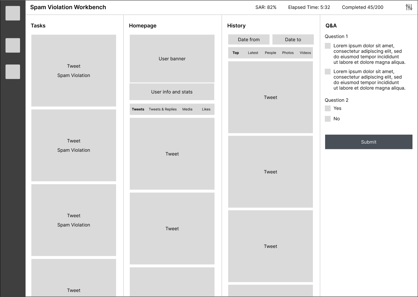
Based on observations from the research and ideation sessions it was clear we needed to bring all data points that the moderators required inline to the app. Accessing data across multiple browser tabs was costing moderators time. We also needed to give the moderators tools to translate and copy text with ease. I spent time producing mock-ups with different layouts, interactions and ideas and met again with the team to validate.

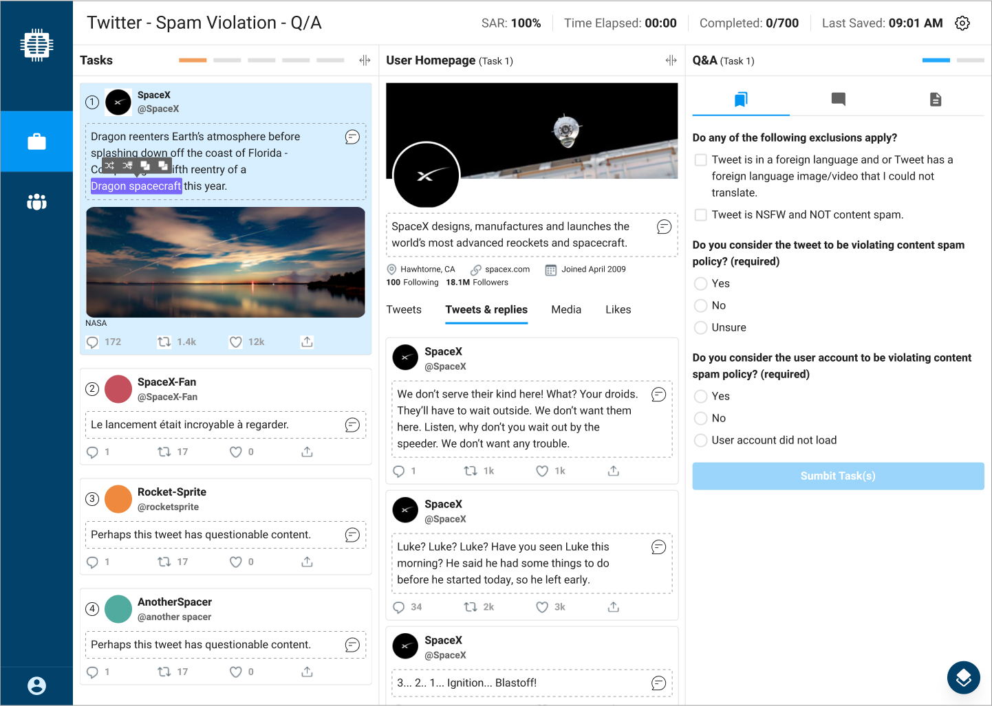
While the team agreed with most design concepts, the interface was busy and missed important elements. We continued to brainstorm and iterate the design to take away extraneous items (history section), add small, useful features (inline translation and batch/task progress) and improved interactions (minimize tasks when completed).

Solution
Once the design was complete and we had stakeholder sign-off, I finalized the wireframes and acceptance criteria. We met with engineering to kick off the development phase and had touchpoints with them regularly to ensure the design was understood and implemented correctly.
After the workbench had been in production for a few weeks, we were able to pull some stats and reactions from the Twitter team to back up our initial goals and KPIs.